KI-Beratung Beta

  • Produktbild: Die typografische Komposition
  • Produktbild: Die typografische Komposition
  • Produktbild: Die typografische Komposition
  • Produktbild: Die typografische Komposition
  • Produktbild: Die typografische Komposition
  • Produktbild: Die typografische Komposition
  • Produktbild: Die typografische Komposition
  • Produktbild: Die typografische Komposition
  • Produktbild: Die typografische Komposition
  • Produktbild: Die typografische Komposition
  • Produktbild: Die typografische Komposition
  • Produktbild: Die typografische Komposition
  • Produktbild: Die typografische Komposition
  • Produktbild: Die typografische Komposition
  • Produktbild: Die typografische Komposition
  • Produktbild: Die typografische Komposition
  • Produktbild: Die typografische Komposition
  • Produktbild: Die typografische Komposition
  • Produktbild: Die typografische Komposition

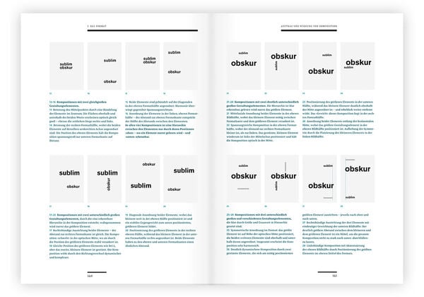
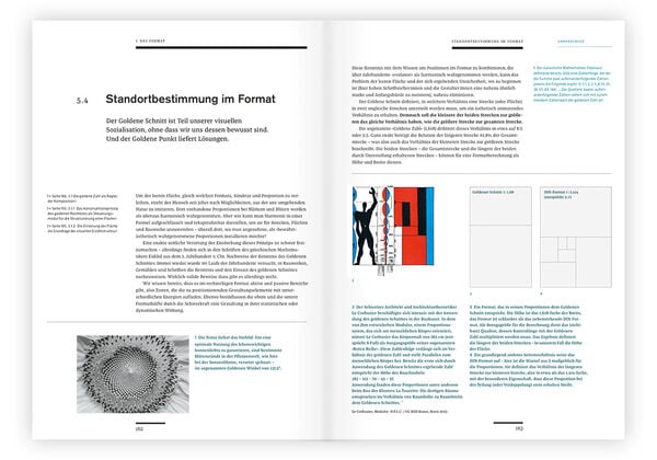
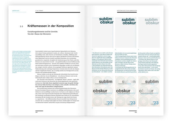
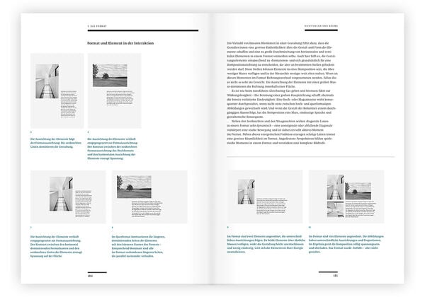
Die typografische Komposition Das System »Typografie und Layout« als Fundament für Ihre Kreativität und Effizienz

Fr. 89.90

inkl. gesetzl. MwSt., Versandkostenfrei


Beschreibung

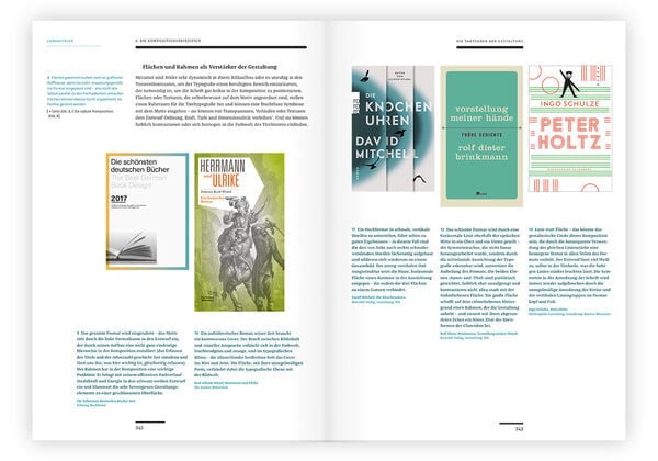
Typografie und Layout setzen auf bewährte handwerkliche und ästhetische Grundlagen, die Ihnen im Gestaltungsprozess Orientierung und Halt geben – sowie Effizienz und Effektivität in Ihre Kreativarbeit bringen. Das System »Typografie und Layout« bildet die Basis für Ihre Gestaltung. Martin Mosch führt...

Beschreibung

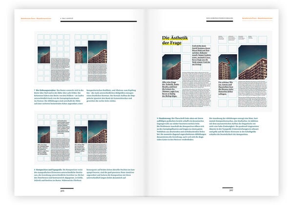
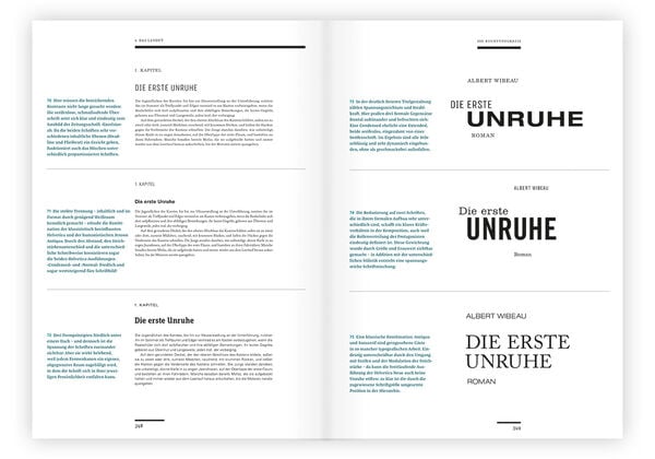
Typografie und Layout setzen auf bewährte handwerkliche und ästhetische Grundlagen, die Ihnen im Gestaltungsprozess Orientierung und Halt geben – sowie Effizienz und Effektivität in Ihre Kreativarbeit bringen. Das System »Typografie und Layout« bildet die Basis für Ihre Gestaltung. Martin Mosch führt Sie vom kleinsten Element, dem Buchstaben, über Wort und Zeile, Kolumne und Format zum grossen Ganzen, den Kompositionsprinzipien und dem Layout.
In diesem Praxisworkshop erkennen Sie, wie Detail-Entscheidungen die Wirkung der Gesamtkomposition beeinflussen, welche visuellen Strategien wie wirken, was es im Gestaltungsprozess zu beachten gilt – und wie Sie Ihren Kreativalltag einfacher und erfolgreicher gestalten können. Ausgehend von Sehgewohnheiten und Leseverhalten stellt dieses Buch Ihnen das Handwerkszeug für den gekonnten Umgang mit Schrift und Bild zur Verfügung – ein Fundament, auf das Sie vertrauen und Ihre Spitzenleistungen der visuellen Kommunikation aufbauen können.

Produktdetails

Verkaufsrang

21583

Einband

Gebundene Ausgabe

Erscheinungsdatum

03.04.2024

Abbildungen

mit über 800 Abbildungen

Produktdetails

Verkaufsrang

21583

Einband

Gebundene Ausgabe

Erscheinungsdatum

03.04.2024

Abbildungen

mit über 800 Abbildungen

Verlag Verlag Hermann Schmidt
Seitenzahl

368

Maße (L/B/H)

30.3/22.5/3.5 cm

Gewicht

1619 g

Farbe

Champagner

Auflage

1. Auflage

Sprache

Deutsch

ISBN

978-3-87439-873-2

Herstelleradresse

Schmidt Hermann Verlag
Gonsenheimer Straße 56
55126 Mainz
DE

Email: info@verlag-hermann-schmidt.de

Noch keine Bewertungen vorhanden

Verfassen Sie die erste Bewertung zu diesem Artikel

Helfen Sie anderen Kundinnen und Kunden durch Ihre Meinung.

Kundinnen und Kunden meinen

Bewertungen (0)

Weitere Artikel finden Sie in

  • Produktbild: Die typografische Komposition
  • Produktbild: Die typografische Komposition
  • Produktbild: Die typografische Komposition
  • Produktbild: Die typografische Komposition
  • Produktbild: Die typografische Komposition
  • Produktbild: Die typografische Komposition
  • Produktbild: Die typografische Komposition
  • Produktbild: Die typografische Komposition
  • Produktbild: Die typografische Komposition
  • Produktbild: Die typografische Komposition
  • Produktbild: Die typografische Komposition
  • Produktbild: Die typografische Komposition
  • Produktbild: Die typografische Komposition
  • Produktbild: Die typografische Komposition
  • Produktbild: Die typografische Komposition
  • Produktbild: Die typografische Komposition
  • Produktbild: Die typografische Komposition
  • Produktbild: Die typografische Komposition
  • Produktbild: Die typografische Komposition

  • Typografie


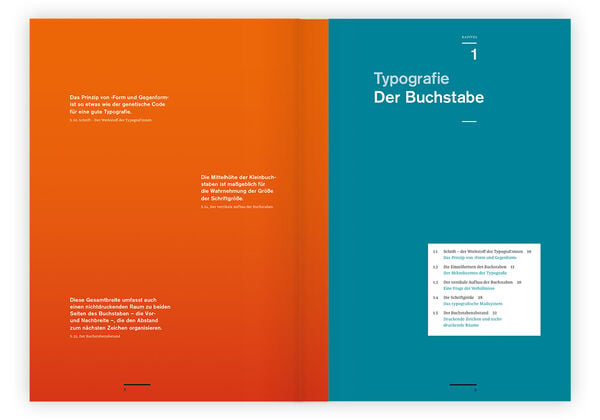
    1. Der Buchstabe


            Kapitel 1 beschäftigt sich mit Werkstoff der Typograf:innen: dem Buchstaben.


            Es erklärt den Aufbau und benennt die Einzelformen der Zeichen.


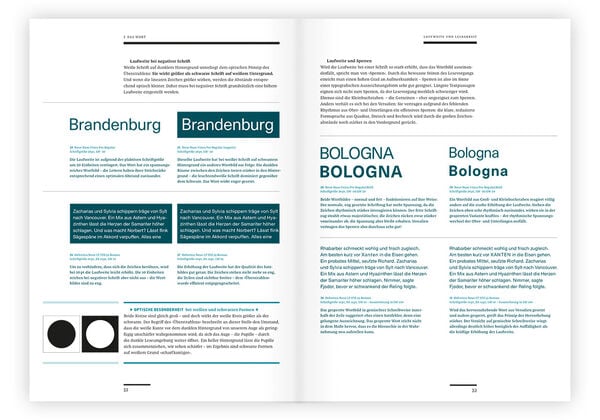
    2. Das Wort


            Kapitel 2 analysiert das rhythmische Zusammenspiel der druckenden und nichtdruckenden Teile


            und erläutert die Faktoren zur Gestaltung guter Wortbilder. Es stellt alle Mitglieder einer großen


            Wortfamilie vor.


    3. Die Zeile


            Kapitel 3 behandelt die Zeilenlänge und Wortzwischenräume.


            Vor allem das Zeilenende - den Umbruch - und den Abstand zur Folgezeile.


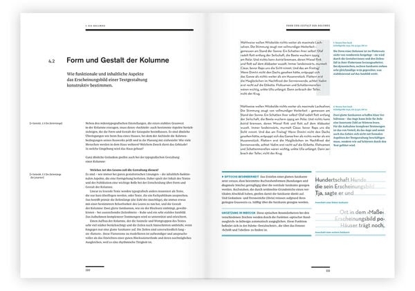
    4. Die Kolumne


            Kapitel 4 beschäftigt sich mit der Lesbarkeit einer Kolumne:


            dabei mit den wesentlichen Satzmethoden Flattersatz und Blocksatz.


    Komposition


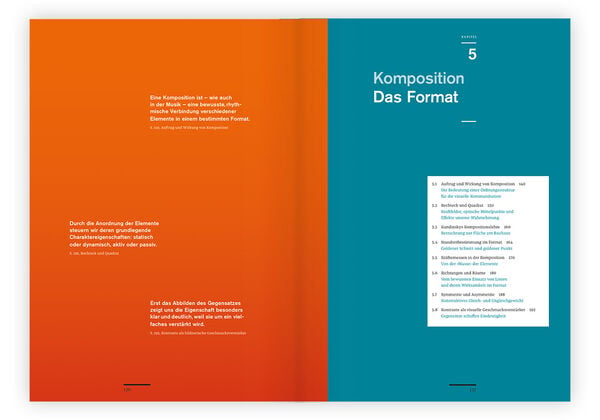
    5. Das Format


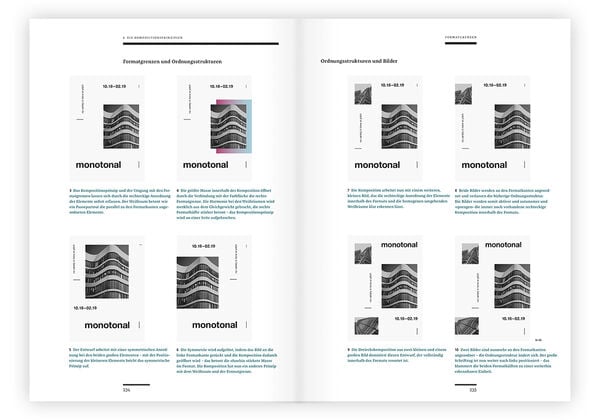
            Kapitel 5 analysiert das Zusammenspiel der Gestaltungselemente


            und gibt eine Einführung in die bildnerischen Mittel.


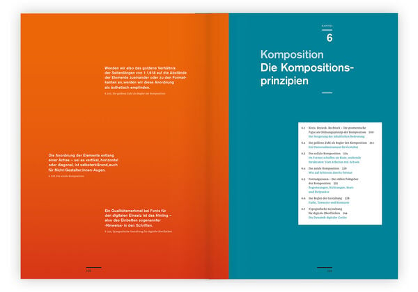
    6. Die Kompositionsprinzipien


            Kapitel 6 erklärt die Relevanz von
    Dreieck
    |
    Kreis
    |
    Quardrat
    als Grundprinzipien der Gestaltung


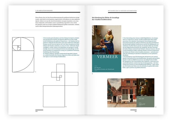
            und analysiert die goldenen Zahl hinsichtlich ihrer Funktion als Leitidee einer Komposition.


    7. Das Layout


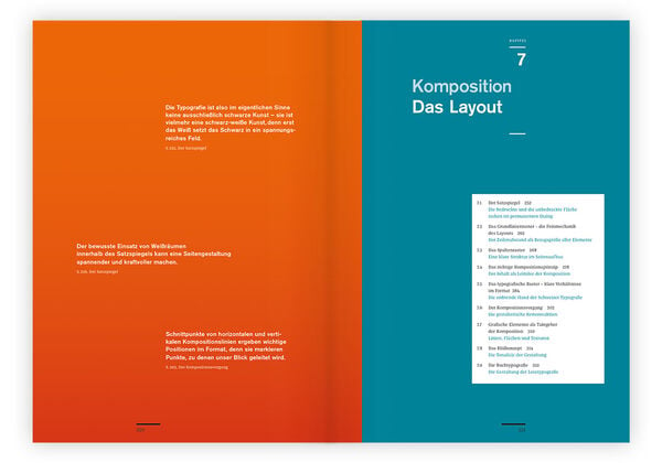
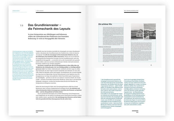
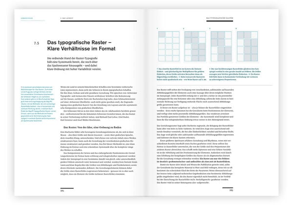
            Kapitel 7 erklärt das typografische Raster und begleitet kleinschrittig den Kompositionsvorgange.


            Mit ausführlichem Anhang zur Buchtypografie.